Coding Dojo’s EnrollApp
Project Overview
Background
Coding Dojo’s Bootcamp applicants utilize Coding Dojo’s EnrollApp to complete their enrollment process.
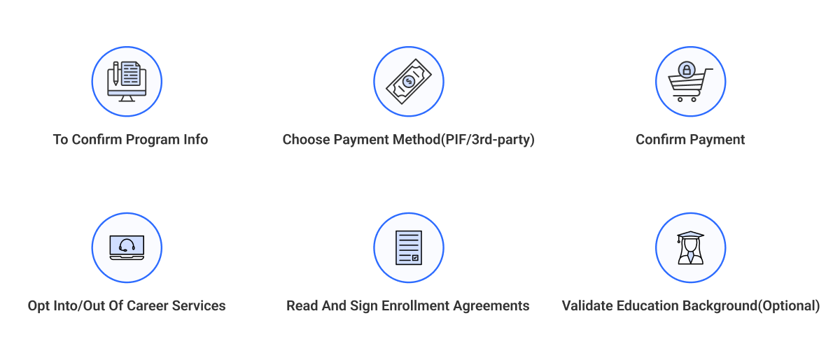
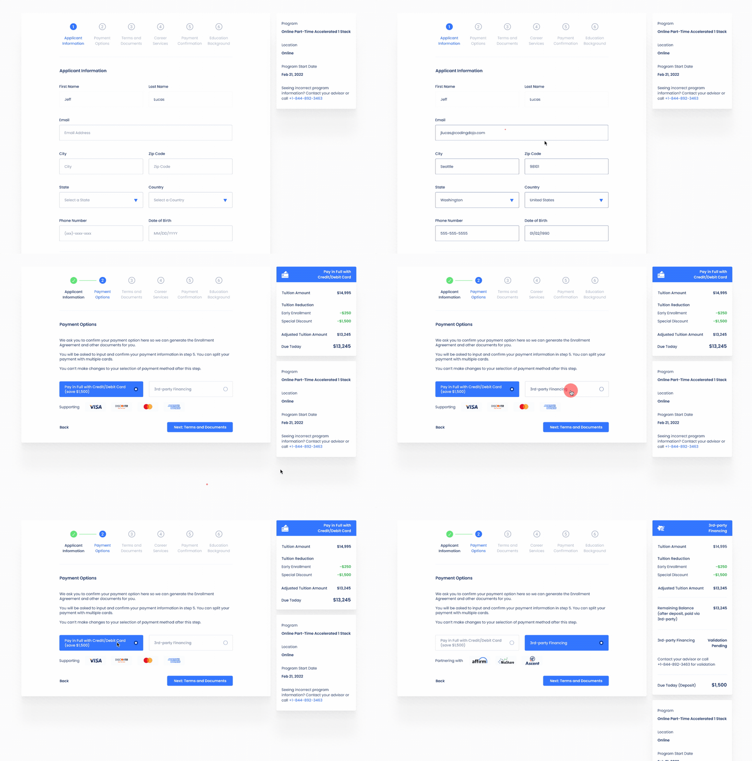
There are 6 major tasks we wish our users(the applicants) to complete via using the EnrollApp.
Discover
Business Issues
Challenge - Hard to reach real users
Interviewing the Director of Student Enrollment Team to better understand the problems
One of the biggest challenges I had was the inability to interview applicants who actually decided to drop out of the enrollment process.
Instead, I did multiple interviews with Student Enrollment team members, who were in direct contact with most of our applicants after they submitted their applications online.
- “Tell me about how you interact with applicants.”
- “How do you walk your applicants through the EnrollApp?”
- “What was your process for trying to navigate ambiguity in EnrollApp for your applicants?”
-` “What are some of the most common frustrations you’ve heard from your applicants related to EnrollApp”
Heuristic Evaluation
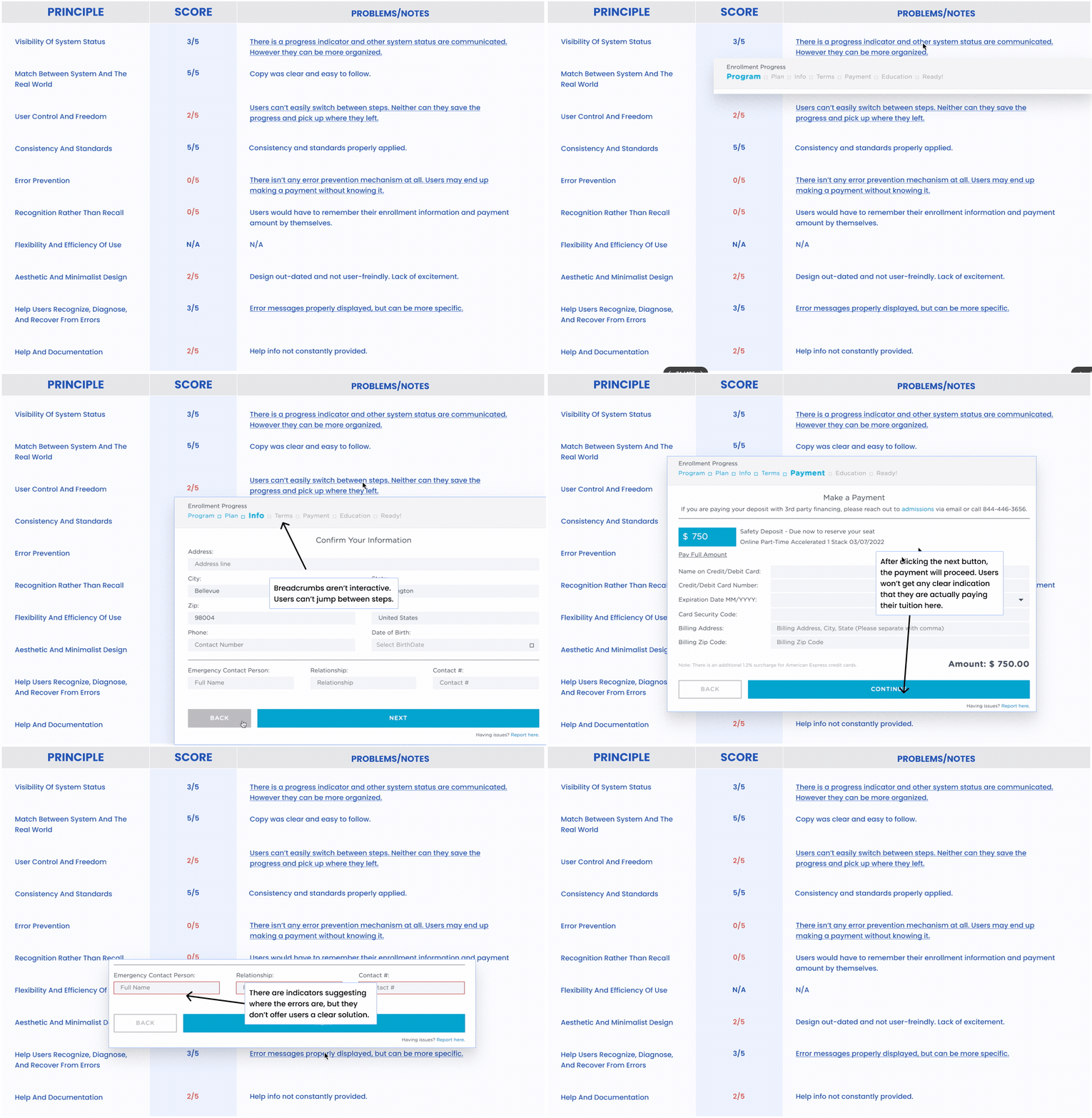
After interviewing the stakeholders, I wanted to personally regenerate the experience of using the EnrollApp. I conducted a heuristic evaluation of the EnrollApp using Nielsen Norman Group’s 10 Heuristic Principles.
Define
User Pain Points
Based on user research results, I was able to generalize four major user pain points:
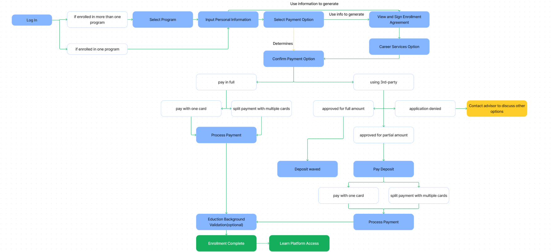
Original User Flow
I was also able to map out the original user flow, and identified a few major areas where the risk of losing applicants was high:
Card Sorting and User Flow Remapping
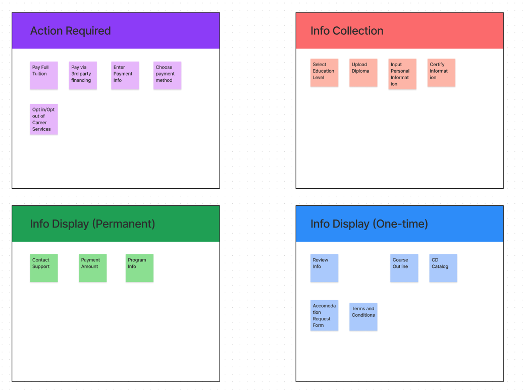
To understand how to better re-organize the actions, steps and information from the original EnrollApp workflow, we conducted a card-sorting exercise with our major stakeholders(Student Enrollment Team, Marketing Team and Learning Science Team).
We listed each potential interaction point as individual items, and worked with the stakeholders to group them into different categories, including Action Required, Info Collection, Info Display(Permanent), Info Display(One-time).
Success Metrics
With the user research results, we were able to confidently set these success metrics:
Design
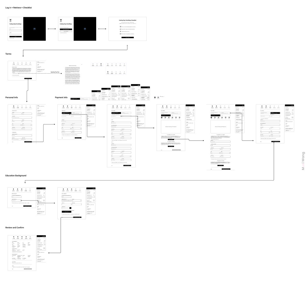
Wireframes
We designed multiple versions of wireframes and hosted multiple critiques to collect feedback. We conducted usability testing with stakeholders to identify the most intuitive layout and user flow.
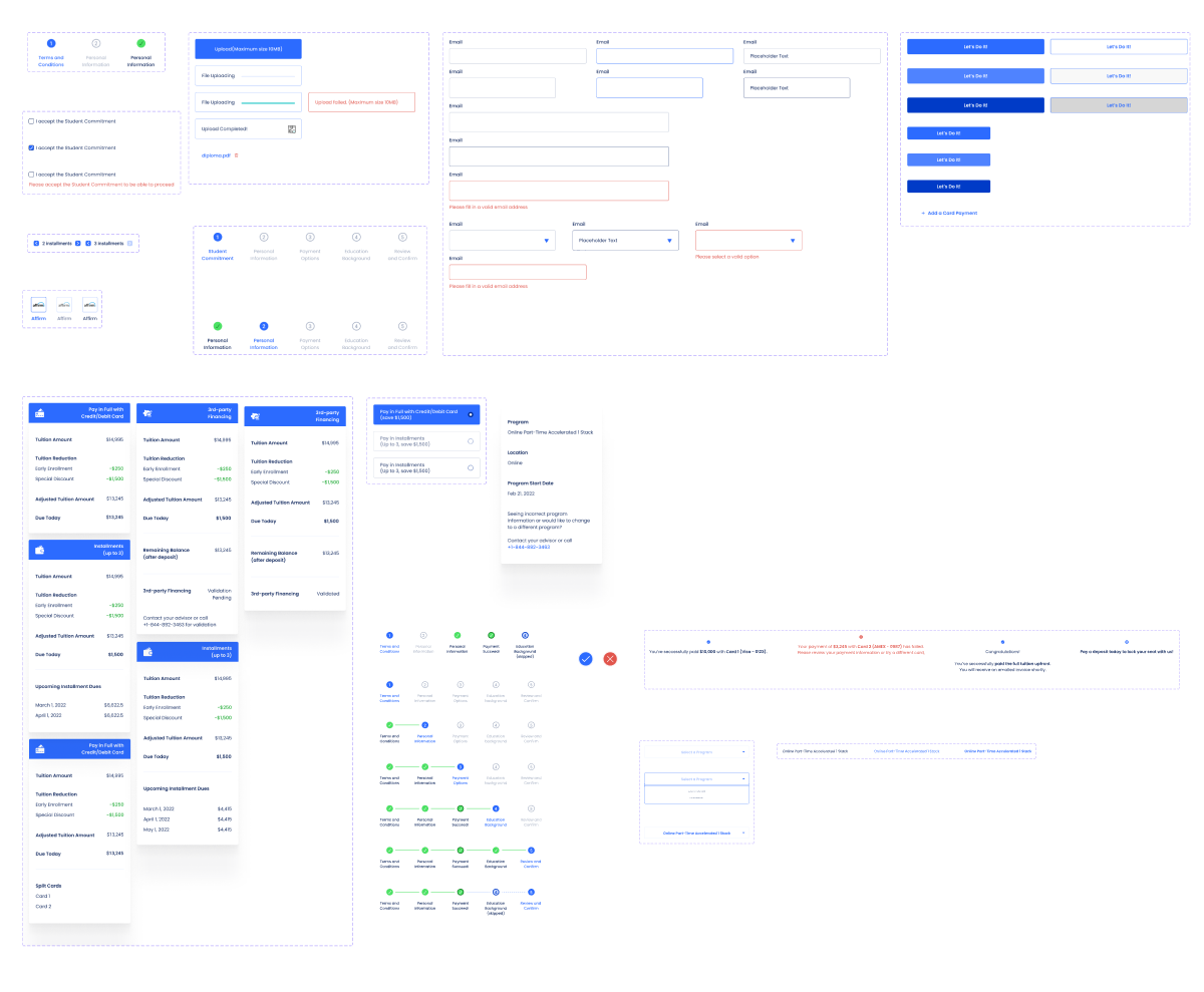
UI Components
Given the EnrollApp is the first digital tool Coding Dojo’s students would have to utilize, it was important that we offer an intuitive experience with a concise, simple UI layout. I also made sure to create different states of UI components, so we can better implement an experience with detailed interactions for our users.
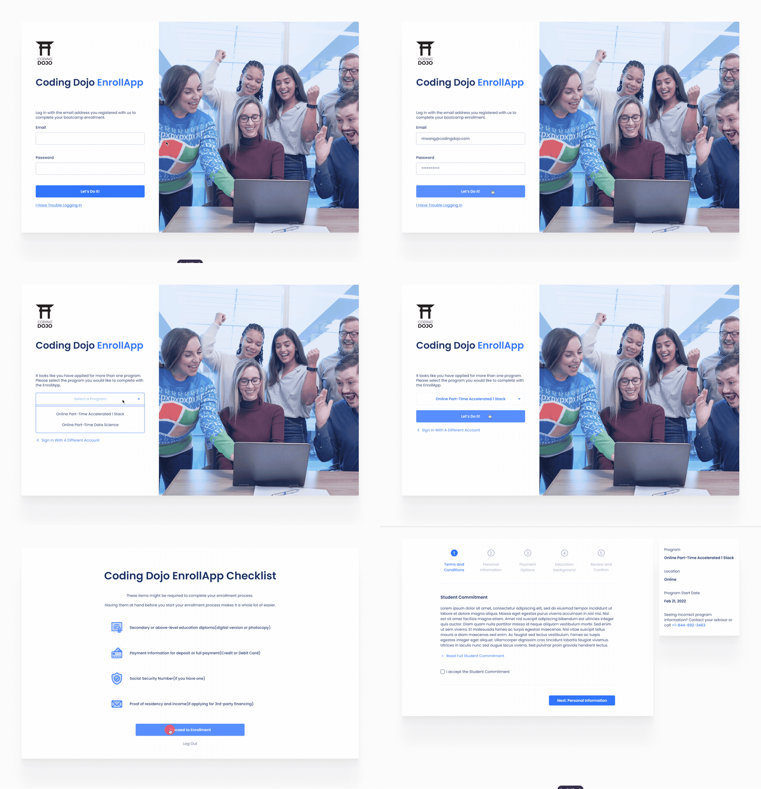
Prototype
Highlight 1: Allowing users to select their program if they are enrolled in more than one program
+
Highlight 2: Displaying a checklist ahead of the enrollment process to remind users documents that they would need to prepare ahead, so they won’t have to stop during the enrollment process to look for them
Highlight 3: brand new navigation UI and floating widgets to constantly inform users where they are, what they have completed and what to expect.
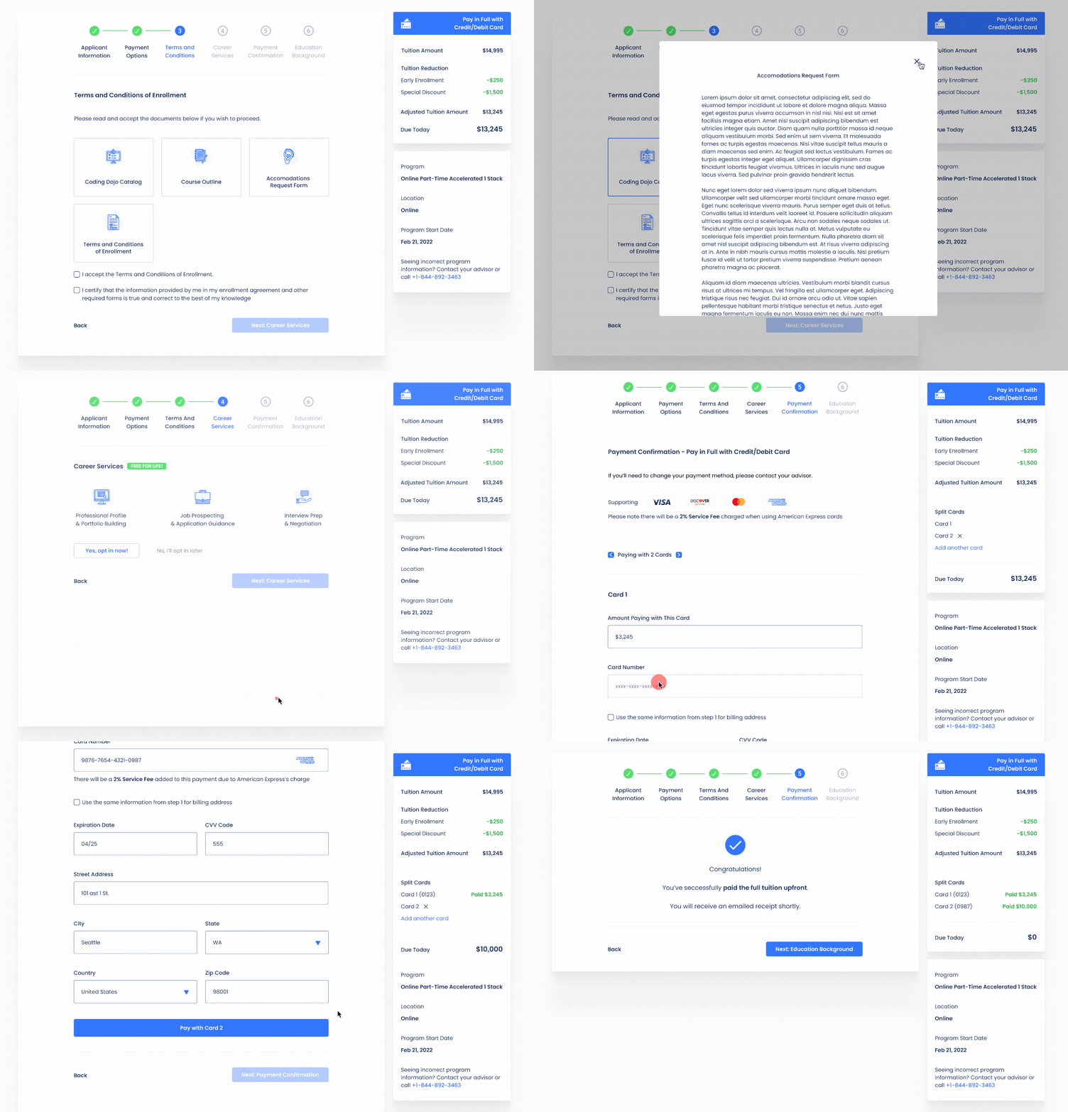
Highlight 4: Clearly showcasing the documents/files users need to read and sign using with a card view.
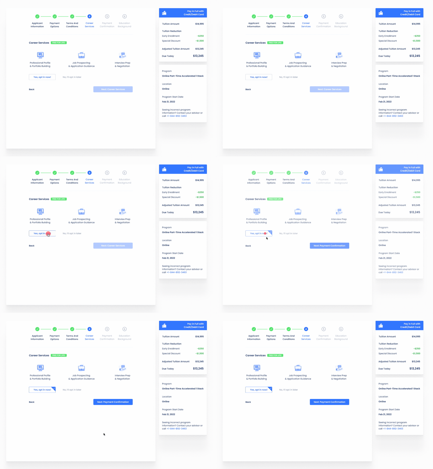
Highlight 5: Making the Career Services Opt-In Screen a separate step to promote it more. Also users are requested to decide to opt in or not in order to move on to the next step.
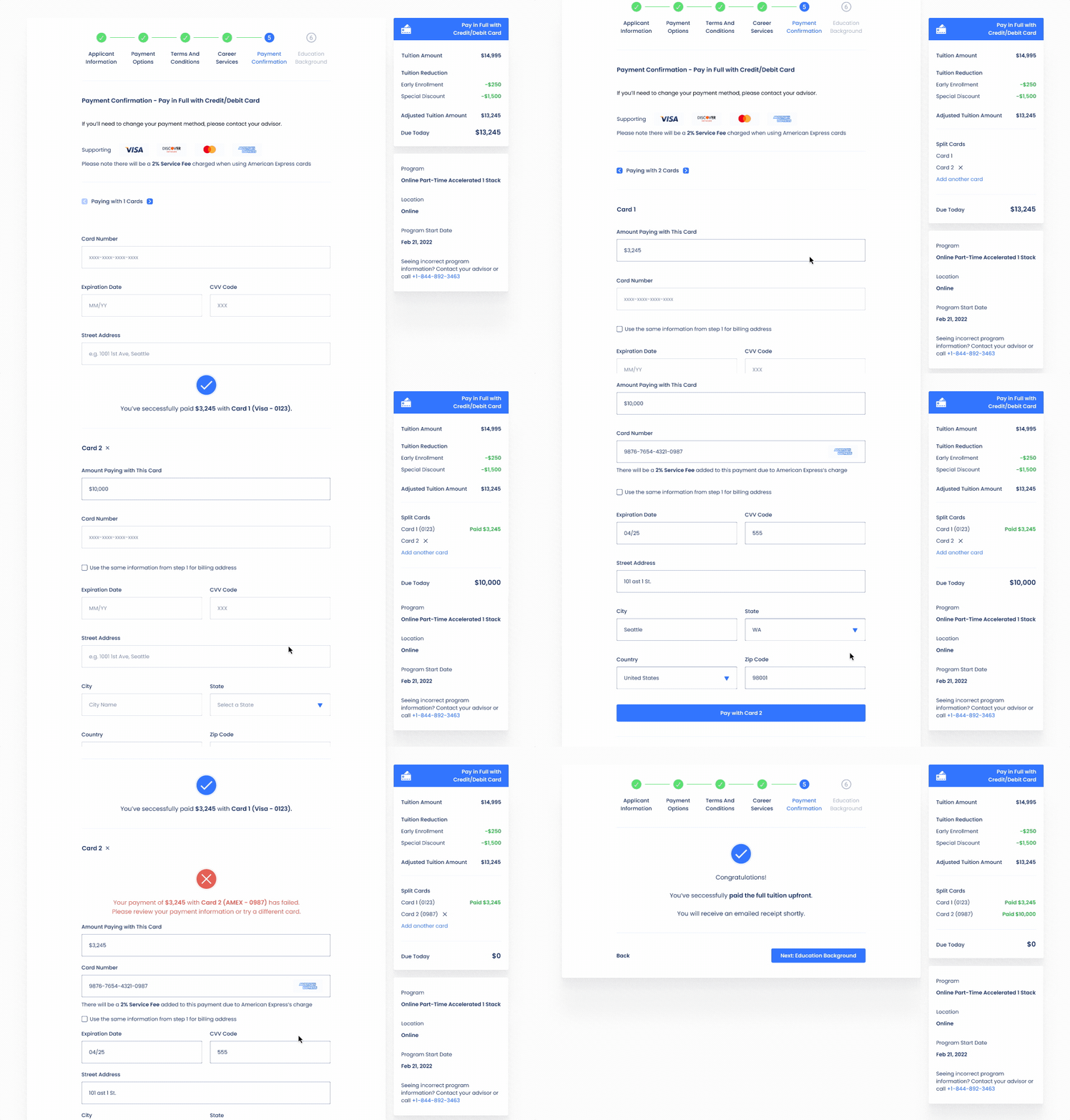
Highlight 6: Allowing splitting payment with multiple cards to allow users more flexible payment methods. Advised by the dev team, I’ve made the split payment separate steps, so when there is a payment declined, users and us can both easily identify which card was responsible for the failure.


